Friday, March 29, 2013

Easter Eggs

On a blog about color, I couldn't resist posting these Pantone inspired Easter Eggs this week.
Very clever, very fun and an original way to bring some spring colors into your home.


(Image from All About Orange on Blogspot.com)
 
 
Enjoy the day!


Tuesday, March 26, 2013

"New" Old Home

Last Thursday I was fortunate to be part of a fun "Spring Fling" event in Winchester, Massachusetts, which featured a property for which I had been hired to select both interior and exterior colors. After seeing a post about the event on my Facebook, a client asked me to share some more of the photos on my blog.   Here are some photos from this "new" old home.

(All photographs are courtesy of Alan Myers.  Check out his work at www.bostonimagemakers.com.)

The Exterior Body Color is a Benjamin Moore custom-mix.
The shutters are painted California Paints "Fieldstone" and the front and side doors are Martha Stewart Living Paints "Gabardine."  I really wish that you could see the door in this photo, it's a wonderful denim blue color with a hint of green.
 
When doing color consultations for spec homes, or homes purchased by builders with the intent to renovate and resell, I have to take a different approach with my color selections as the home(s) need to have mass appeal. I aim to give the feeling of "move in" quality to help the buyer envision their belongings in the new space. I have to be careful in my selections as people have very different emotional reactions to color and ultimately the goal for houses on the market is to have them sell quickly.

In the interior photo, below, the main entrance has a warm yet neutral color. With all of the beautiful woodwork and glass leaded windows it was better to accentuate the architectural details rather than have a bold color detract from the unique features of the home.

The walls are painted Benjamin Moore's "Manchester Tan," a historical color with a warm undertone for this historic and prominently located home.


This home had AMAZING original woodwork in the dining room (below) with a built-in leaded glass china cabinet. The wood itself was in fantastic condition so the builder thought well enough to leave it alone. I suggested a pearly white on the ceiling and limited wall space to illuminate this otherwise dark room located in the back of the house. It is a beautiful room but as you notice the floors were much lighter than the paneling so anything other than a neutral color would have really made the room feel choppy.


I had fun selecting the color for the third floor Billiards Room.  It had a built-in mahogany bar and somewhat of a men's club feel.  The green walls were intended to mimic the felt on the top of the pool table.
Walls are painted Benjamin Moore's "Peale Green"
 
 
While the bathrooms still need to remain somewhat neutral, tiles can certainly dictate color direction.  In this photo, a blue with violet undertones team up well with the Carrara Marble floors.  This hue might suit both teens and adults.

The beauty of paint is that when you are working with older homes, it can showcase your best architectural elements or divert attention away from unusual issues or building designs. 

Finally, I must confess, these pictures don't even tell half the story as they were taken before the home was staged for the event.  Ellen Fador of "Spectacular Spaces"  (www.spectacular-spaces.com) did the staging and she did a wonderful job.   (When I have a chance I will take some more pictures of the rooms and share them as well.)

Once the paint and the staging were completed, this old home felt new again.  Let's hope an offer is forthcoming!
(A picture of the back of the house. With no flowers budding and the shrubbery hidden beneath the snow, the custom-mix yellow color brightens the bleak winter scenery in New England.)
 
If you have a home in the Boston area that you are getting ready to sell, I would love the opportunity to work with you.  Check out www.suecolor.com for more information.


Thursday, March 14, 2013

Spring?


COULD SPRING REALLY BE HERE?

I snapped this picture of these daffodils poking their heads through old pine needles and recent snow.  Ahhh, at last a small sign of spring!

It made me think about combinations of yellow and green and why it's no surprise that early spring flowers such as daffodils are made up of these beautiful colors.

YELLOW symbolizes energy and life while GREEN symbolizes harmony. Both can make wonderful statements in your home.

One of my favorite combinations of yellow and green is Farrow & Ball's "Dayroom Yellow" paired with "Breakfast Room Green", also by Farrow & Ball.

 
Depending on your furnishings and lighting, these colors are fabulous for interior rooms.  "Dayroom Yellow" is warm and energizing and "Breakfast Room Green" can be very inviting with its extremely slight yellow undertone.


(Images from Farrow-Ball.com)

You could use the pair in adjoining rooms -- the effect would be fabulous!  It would certainly give your interior a breath of fresh spring air.  Enjoy the day!


Tuesday, February 26, 2013

On a Scouting Mission

Our dog "Scout" is an English Springer Spaniel.  When he was little, and it came time to pick our Springer from the litter, our first choice was a puppy with brown and white coloring versus a black and white combination.

Scout as a newborn, can you pick which one he is? :)
(Photo Courtesy of Carol McDonough)
  
In the world of dog breeders the correct description for a Springer Spaniel with brown and white markings is actually liver and white.  However in the world of color I would describe Scout as a  divinely rich, warm brown.  He is scrumptious!  (And I'm not just saying that because he is my dog! ha!)
 
The color brown is made up of a combination of orange, red, rose, or yellow with grey or black. Since it is a color that is associated with the earth itself it can represent stability, security and comfort.  It is a color that can be warm and rich yet surprisingly neutral.
 
I have always wanted to match Scout's coloring to a paint color (however I thought I would have to actually custom mix my own) which is why I enjoyed reading a recent story about a paint store in upstate New York that matched a dog's coat to an actual paint color!  This inspired me to revisit the thought of painting a room "Scout!" 
 
If I had to pick the best match to Scout's fur, I would have to go with Ralph Lauren's "Library Mahogany" (#NA31).  Though there are so many fabulous browns out there, this one is particularly sumptuous because of the depth of the chocolaty brown hue.
 
(Photo by me)
(And believe me, this photo in no way does the color justice!)
 
Pairing a deep brown, such as this one, with a clean, crisp white can be dramatic, yet cozy, in any room.  I think Ralph Lauren's "Brilliant White" (#ML01) would work nicely with the "Library Mahogany".   Check out the drama and coziness in this photo:


This brown can also act as a wonderful neutral where you could inject brighter colors as accents.  Bold pinks, fun greens or touches of soft blues can make the combination even more interesting.
 
(Image via Pinterest)
 
(Image via Pinterest)
 
(Image via Pinterest)
 
It's fun to imagine but for now I'll have to dream about a room where those "Library Mahogany" walls will simply envelop me as I don't have a room in my own home ready for repainting.  I'll have to "scout" out another opportunity to use this color in a client's home and in the meantime enjoy the coziness of hugging my dog instead!
 

 SCOUT!
 (Photo by me)
 
 
Do you have a dog whose coat would make a beautiful backdrop to a favorite room?


Thursday, February 14, 2013

Red Silk Lining

HAPPY VALENTINE'S DAY!

Though many of the beautiful gifts being exchanged today come with a red silk lining, I thought it would be fun to share a beautiful "Silk Lining" of another kind. 

Martha Stewart Living Paints' "Silk Lining" (#MSL021)


It is a luxurious,  muted red with a hint of orange.

I discovered this beautiful color when my niece Molly signed the lease to her first apartment in NYC.  She began planning how she was going to furnish her new place.  I knew, with her taste, the apartment would be packed with style!  She pulled together an eclectic mix of old and new furnishings - dusting off some pieces and giving them new life with a fresh coat of paint. I consulted with her on a few colors for the painted pieces to give her new home, with the standard netural walls,  a little burst of fun.

.

I suggested this fabulous color by Martha Stewart Paints (available at Home Depot).   Painting an old chest of drawers with "Silk Lining" in a high gloss finish helped add a little drama and warmth to the room.  This color is simply GORGEOUS!  I love how it adds wonderful contrast to the surrounding  neutral walls.

.

Painting a piece of furniture can be a fun winter project.   Painting it red in a high sheen can add a little glamour and wonderful, warm energy to your Valentine's Day! 


Monday, February 11, 2013

White Out


After digging out from the Blizzard of 2013 here in Boston, I thought it appropriate to talk about white.  Ironic, I know, that with a blog on color I'm choosing one of my first posts to be about white.   However I am often asked which white paint should be used for the interior trim of one's home.  Of course there are infinite possibilities of color to paint your trim but when you are considering using white paint for a trim color it is important to recognize the different undertones as they will play a critical role in how the wall color will read.  A very common white trim color specified by consultants and painters is Benjamin Moore's "White Dove" (#OC-17).  It is a clean white that is not too yellow and not too gray so it won't throw off the true color of your walls.


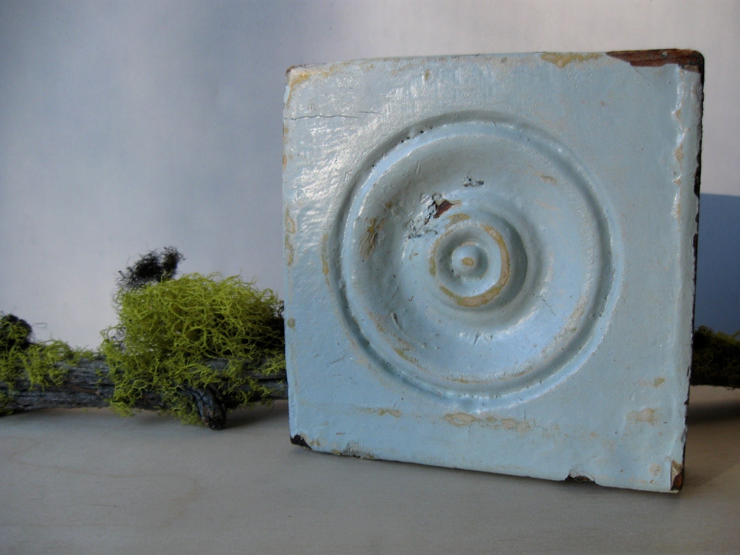
 I often like to specify a high white color for older homes that have interesting moulding (such as bull's eye moulding) to make these decorative elements really pop. 
(Source Etsy.com)

A good choice for a high white is Benjamin Moore's "Super White" (#I-02) as it is a clean white that provides a wonderful and dramatic contrast to the wall color.

There are others who prefer a softer, more yellow, white such as a Benjamin Moore's "Linen White" (#912) to create an understated look to whatever woodwork they have in their home.  While this white can be more subtle be careful that it doesn't add too much yellow to the wall color. 


Clean and crisp whites, or soft whites, will all add interesting detail to your room or rooms.  So go ahead and put the white out!


Wednesday, February 6, 2013

Welcome to Complete Color!

Well, after much encouragement from so many I am finally taking the plunge into blog world.  This is going to be very exciting as I share so many of the fun ideas, thoughts, images, and concepts about colors that run through my mind daily.  I welcome your thoughts and opinions on colors that work in your living spaces (home and work - depending on the day!) and I hope to help you discover more about your own personal color preferences.    I welcome you to "Complete Color".  Enjoy!